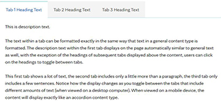
This is description text.
The text within an accordion can be formatted exactly in the same way that text in a general content type is formatted. The only difference is that the section needs to be clicked on to expand in order to view the content within the accordion.
Lorem ipsum
Lorem ipsum dolor sit amet, consectetur adipiscing elit. Curabitur consectetur lacinia ligula, id volutpat dolor mattis vel. Pellentesque porta a urna vel porta. Nullam eu massa id orci aliquet imperdiet ut non tellus. Maecenas molestie massa enim. Phasellus quis arcu semper, accumsan dui sed, faucibus nulla. Mauris congue enim id ante dictum bibendum. Nullam facilisis nisi a neque dictum efficitur. Ut tempor ornare aliquet. Fusce cursus urna eget lacus tempor, id rutrum magna mollis. Etiam id dolor elementum magna egestas tincidunt. Phasellus sodales enim enim, sit amet laoreet diam blandit sed. Duis interdum pharetra condimentum. Nam posuere sodales condimentum. Nullam id odio egestas, elementum sem vitae, pellentesque ligula. Sed commodo tempus lacus, in lacinia eros interdum rhoncus.
Nunc orci sem, placerat et tortor eu, scelerisque interdum dui. Orci varius natoque penatibus et magnis dis parturient montes, nascetur ridiculus mus. Class aptent taciti sociosqu ad litora torquent per conubia nostra, per inceptos himenaeos. Pellentesque pretium, massa ut dictum rutrum, arcu metus maximus mauris, eget aliquet quam mi ut orci. Proin rutrum, tortor ac congue pharetra, justo diam ultrices nunc, ac congue libero diam sit amet libero. Nunc eget mollis tellus, vel congue dolor. In vestibulum libero eget sem venenatis, varius sodales sem ullamcorper. Sed eleifend diam sit amet tincidunt vestibulum. Mauris accumsan tincidunt sapien at sagittis. Aliquam sit amet turpis vel dui laoreet venenatis. Phasellus felis mi, rutrum at sodales eu, gravida et dui.
Ut commodo nunc quis nibh tristique faucibus. Pellentesque mollis nunc sit amet lacus laoreet vehicula. Praesent pulvinar purus non ultrices gravida. Maecenas placerat turpis vel sagittis porta. Aenean ut arcu lacus. Proin consectetur magna malesuada ligula accumsan, sit amet lobortis sem accumsan. Praesent tincidunt arcu eu tellus blandit, ornare volutpat massa hendrerit. Etiam commodo eget leo auctor aliquet. Maecenas ac sagittis mauris. Nullam aliquam facilisis ipsum, sed lacinia dolor pharetra id. Praesent tempor, massa at rutrum sollicitudin, ipsum lacus dapibus quam, varius faucibus lacus lectus at orci. Integer purus tortor, dapibus lacinia libero sed, commodo elementum lorem. Aenean porta diam in tincidunt interdum. Nunc in fermentum purus. Praesent faucibus consequat est sit amet convallis. Vivamus ut turpis non nulla gravida finibus id nec dui.
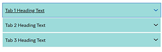 On mobile devices, tabs appear exactly like an accordion content type. The heading of each tab needs to be clicked to expand in order to view the content within that tab. A screenshot example of what it looks like on mobile device is included below. You can also see this display difference in the tab examples if you decrease/increase the size of your browser window on a desktop computer.